Thursday 28 February 2013

Music Magazine: Improvements

My Teacher informed me that my front cover, had a lack of writing on it and it needed something more, she also suggested to me that I moved the writing over to the left more because of the way magazines are laid out in newsagents, some important bits of my writing wouldn't be seen and this could affect my magazine. Finally she suggested that I should add a bar at the bottom of my front cover because they are very popular with magazines and it will fill my magazine more.
 
This was my front cover before:
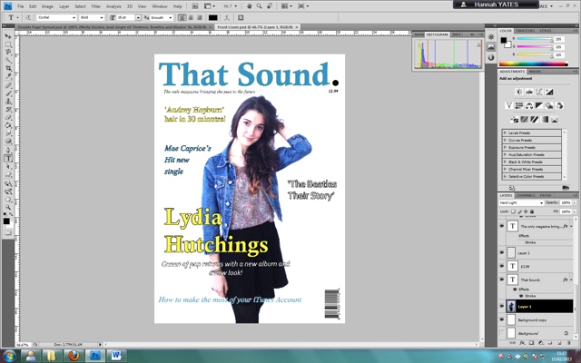
This is my improved front cover:


Music Magazine: Location Choices

These are the different locations I used when taking my photographs:


I used these locations because they had very plain backgrounds and I knew from the planning of my magazine that I wanted a white background for my front cover, and also for the double page spread I knew I wanted to cut out the people from the pictures and I thought it would be easier to use the magnetic lasso tool on a plain background. 

Music Magazine: Improvements

My teacher Mrs Howlett informed me that the background of my double page spread didn't match the other two pages and to keep it in with my house style I should keep the background white.

This was before I changed my background:


However when I changed it back to white, I thought it looked too plain, so I took my picture of a record, placed it in the middle of the page and changed the opacity to 30% so it looks far away in the distance:


Wednesday 27 February 2013

Music Magazine: Editing

Adding the record. Through my research I have noticed that magazines had recognisable features to ake the audience remember their brand. I want the record to be a recognisable feature of the magazine, if people saw writing with a record for the letter O they would think of my magazine 'That sound.'

I have a picture of a record:

That I have cut round using the magnetic tool on photoshop:


Now I have pasted it over the 'O's in the headings in my magazine:


Music Magazine: Improvements

My teacher Mrs Howlett informed me that my double page spread could be confused for a fashion magazine instead of a music magazine, so I have decided to alter the paragraphs at the top of the pages, this makes the pages relate more to music, however not changing my idea.

My paragraphs used to read:

'Lydia Hutchings new album 'The Truth About Us', available from 20th April 2013'

'Molly Dunlea, lead singer of 'Violence, Bowties and Blazers' their first album 'Ignore This', released 13th March 1967'

They now read:

'Lydia Hutchings new album 'The Truth About Us', available from 20th April 2013. In her new music video of her single 'Fight' she is seen wearing this outfit, you to can have the look.' 

'Molly Dunlea, lead singer of 'Violence, Bowties and Blazers' their first album 'Ignore This', released 13th March 1967. In their first live performance of 'Liana' she was seen wearing this outfit, you to can have a similar vintage look of the past artist.'

Tuesday 26 February 2013

Music Magazine: Choice of Actors and Outfits

I chose Lydia and Molly to be my actors because Lydia is my Future artist and she has wide, bright eyes, which I thought would help a lot with making the audience feel engaged, her looking into the camera shows a connection between the audience and Lydia. Also I chose Molly because she is already in a band which helps, also because she has a lot of vintage clothing and I thought she could help me with portraying a past artist.

I chose these outfits for Lydia because they look nice on her although they don't look too fancy or expensive, which would let the readers of my magazine believe that you don't need a lot of money or expensive clothes to look nice, this will work in my favor as my target audience do not have a lot of money to spend. Also the clothes are suited to the genre.

Finally I chose the outfit for Molly because they look quite vintage and she is my past artist, so the vintage clothes will help my magazine look more realistic. 


Music Magazine: Second Photo Shoot (Molly)

 This is a selection of the Photos from my second photo shoot with my second model, some of them I will use and others I will not.

I would not use this photo as the models head placement is wrong, she moved as I took the photo and so it wouldn't look right in my magazine. 


I would use this photo as the head placement is correct, her whole body is in the shot and also the photo is in perfect focus so it is a good photo.


I would use this photo as the whole body is in shot and the photo is in focus, also she is not looking directly into the camera, and her posture is mature and suitable for older generations. 


However this photo does not have a good posture, the models posture and facial expression looks like it would appeal to a very young audience, and wouldn't suit the audience I am aiming for. 


I would use this photo as I have a clear shot of the ring and so I could cut around it using the magnetic tool on paintshop easily to add to my double page spread. 


I would use this photo as the whole body is in shot and the photo in in focus, also the models eyes are looking directly into the camera.


I would use this photo because there is a nice clear outline of the shoe which I can easily follow with the magnetic tool on paintshop and add the shoe to my double page spread. 

Friday 15 February 2013

Music Magazine: First Draft

My front cover, contents and double page spread so far


Music Magazine: House Style

I have developed a blue, yellow and black and white house style which is very obvious to see in my front cover and contents.


Thursday 14 February 2013

Music Magazine: Editing

I have decided to use three fonts on my front cover to make it look more appealing and I have also used 'hard light' effect on my photo to make the background very plain and makes the photo stand out more. This is the original photo:


This is my front cover so far:


Also I took my bar code from the Internet to make my magazine look more realistic:

Music Magazine: Editing

I have taken photos for my music magazine that I need to get rid of the background for example this one:


I have cut around the edge of the shorts with the magnetic lasso tool then copied it:


I then pasted it on my double page spread:


Music magazine: Editing

For my house style I have decided to use this font Castillo MT I have chosen this because it is easy to read, however it was quite plain for a masthead, however I then added gold stroke:


However it was still quite plain and needed something to make it stand out, therefore I changed the full stop to black so it is more powerful:


This made it a lot bolder and I have also used this as the heading on all other pages so it is an house style.


Monday 11 February 2013

Music Magazine: Audience Questioning

I have made two videos of two people in the age range I am aiming for my magazine and asked them a few questions to see if the ideas I have for my magazine would appeal to them:

http://www.youtube.com/watch?v=lCnE9qIUxDQ&feature=player_profilepage
http://www.youtube.com/watch?v=QgMMBhTq30c&feature=player_profilepage


These two interviews taught me that you have to ask your audience about your ideas before you make your product, for me both of them liked my ideas, however if they hadn't I would of had to change the ideas for my magazine.

Sunday 10 February 2013

Music Magazine: Audience profile


Age: 16 - 25 
Gender: Female 
Music Taste: Mainly pop but a bit of indie and alternative added occasionally 
Other Interests: Cheap days out, also fashion and how to create styles for yourself and being creative 
Disposable Income: Although I started with my magazine price at £3.99 i lowered it to £2.99 as the magazine needs to be quite cheap as the age group it is aimed at do not have a lot of money to spend on magazines. Also the magazine will only advertise gigs for new artists so they will be quite cheap and try and stay away from mainstream gigs. Also any fashion included in the magazine will be based on high street prices. 
Educational Level: Still in education or just leaving education 


Saturday 9 February 2013

Music Magazine: Contents Page analysis


  • This contents page looks very full which makes the audience believe there is a lot in the magazine
  • The big numbers next to photos makes it easier for fans to find the articles about their favorite people
  • 'Q' magazine has a red house style so this contents page includes a lot of red so the contents and cover match 
  • It doesn't have any graphics and the writing is set out very maturely, meaning this contents is for an older audience
  • It uses many different fonts to make it look appealing

This contents page works very well and I would want to make my contents more like this, I think I need to add more pictures to my contents and also add numbers to the photos so people can easily find what they are looking for in my magazine. 

Music Magazine: Double page spread analysis


  • The image is big and takes up over one page showing that people are more interested in images then writing 
  • Also this double page spread uses 4 different fonts to make it appealing and interesting
  • The two big texts of 'USA' and 'Got the love' also take up a lot of the page and the different fonts make them appealing to look at
  • The artist is looking at the camera showing a connection between the artist and the reader
  • The only colour on the page is the red flag, which is very bold compared to the rest of the page
  • The simple colour scheme means it doesn't take away from what the artist is saying in the interview, also it means we can tell this is for an older audience
  • The 'USA' and the flag tell the audience, this interview is going to include a lot about America, this helps the audience know if it is a topic they are interested in reading before they even read the article, however it can also be used as a sort of teaser before you read the interview. 
I have learnt from this double page spread, that sometimes simple things like a simple colour scheme, can be very effective instead of putting loads on a page.

Music Magazine: Front cover analysis


  • This Magazine has an obvious colour scheme of black, white and red which makes the masthead stand out.
  • The artists eyes are looking at the camera which shows a connection between her and the magazines audience. 
  • This cover could appeal to both male and female, as it has an attractive woman on the front, who is influential to both males and females and also the colours used are not categorising 
  • The name of the artists picture is the second biggest writing on the page to the masthead 
  • This front cover has only one picture on it which is the focus point, this tells me it is for an older audience
  • The front cover uses many different fonts which makes it look interesting.
  • The artist on the front cover is posing in front of the masthead which shows it is a well know magazine, so people don’t need to see the whole title.
  • The front cover also has a little animation on it which is eye catching, and so catches peoples attention.

    I want my front cover to be like this as it has an obvious house style, and colour scheme to the front cover. Also it uses a range of different fonts. Also the main image, is a single artist, but someone well known to bring a lot of attraction to the magazine. 

Friday 8 February 2013

Music Magazine: The Industry

In looking into theorys about media, and how people consume it, there are many reasons why some people would buy my magazine:

Blumer and Kates theory from 1974 for people being interested in media like magazines  includes diversion people wanting to escape from everyday problems, also personal relationships, people want to interact, personal identity, seeing yourself in the media, also surveillance, learning and finding out new information.

In 1987 Denis Mcquail developed on these ideas, and it is because of his developments I think my magazine will appeal to some audiences

Firstly diversion - Denis Mcquail believed part of this could be filling time, my magazine could be a good distraction for a short time about life.

Secondly personal relationships - I would want my magazine to include interviews, meaning my audience could feel like they were creating a connection between them and the artist.

Thirdly personal identity - In my magazine the artists I would use I would want to be good role models, which Denis Mcquail believed finding models of behaviour was part of personal identity.

Finally surveillance - my audience will be able to find information, like what they need to do if they want to become artists themselves, or information like charts and interviews which would satisfy peoples curiosity.

Music Magazine: Publisher's

Which Publisher would I publish my magazine with and why?

I would publish my magazine with IPC media this is because I want my magazine to be serious about the music and although it is a pop magazine I don't want it to focus on any celebrity gossip, most of the music magazines IPC publish focus on the music for example NME. Also I would go with IPC because they publish the magazine uncut which focuses on music and movies from the past and present, I also want my magazine to include music from the past and present so going with IPC they would be able to give me advice. Also Bauer Publishing is a big company and they probably wouldn't be able to give me a lot of time and advice on how to approach publishing my magazine whereas IPC is also a big company but split into 5 sections, meaning they would probably be able to give me more time. Also if I went with Bauer Publishing they have many big brand music magazines like kerrang and Mojo whereas uncut is smaller and makes IPC Media look a lot less intimidating. Finally I am aiming my magazine at women and IPC Media reaches 70% of UK women, meaning my magazine would have the potential for a wide audience.

Tuesday 5 February 2013

Music Magazine: First Photo Shoot (Lydia)

Here is a selection of photos from my first photo shoot


I wouldn't use this photo because the model moved meaning her leg is slightly blurred


I wouldn't use this photo as the lighting is wrong making the photo look quite dark and not the uplifting look I would like to use.


I would use both of these photos because the lighting is correct and it has a light background

 
I would consider using this image because it is clear, and a different pose to looking at the camera, showing a range of images in the magazine.

 
I have decided not to use this picture as, the models hair doesn't look well placed, and for a magazine, small details need to be thought about.


I have decided to not use this picture as I would use this picture as the front cover and this picture would take up the whole page not leaving enough space I want for the masthead, and also making her eyes on the wrong level to connect with the audience.


I would consider using this photo however as I have left enough space for the mast head, her hair is all placed on one side and also her eyes are on the correct level to connect with the auidence.

 
I would use this image because if I cut around the shirt on photoshop, I will have a clear item of clothing that the artist is wearing.

Music Magazine: Plan of photos


Friday 1 February 2013

Music Magazine: Double Page Spread Draft


I have decided to make my double page spread on an upcoming artist and a past artist and talk about fashion and their albums, I want to make the photos on each page symetrical to show a connection between past and present music and also make it look eye catching. Again I have used records in the title to make it tie into the house style, and for most of the fonts I am using the house style of yellow, blue and black.

Music Magazine: Front page & Contents page Drafts


I have kept my front cover with just one photo to make it appeal to an older audience, however I am going to use a medium shot, so you can see the eyes clearly that will be looking directly to the audience. Also I am using a colour scheme of blue, yellow and black for the writing, also I have used the record in both the 'That sound' and 'Contents' so it has become part of the house style and something to recognise my magazine by.
 
I have choosen to do an editors paragraph at the top of my magazine as I think it gives the magazine a more interactive feel.