Friday, 15 March 2013
Letter to Moderator
Dear Moderator, I'm Hannah Yates and my candidate number is 9349. I have finished all the tasks in this process including my preliminry task, my finished front cover, contents page and double page spread that I completed on Photoshop and also my evaluation that I completed on Prezi. I have included in my blog, the many things I have learnt through out this process and I hope you enjoy looking through my blog and finding out what I learnt.


Thursday, 14 March 2013
Music Magazine: Evaluation
I did the evaluation of my magazine that sound on Prezi:
http://prezi.com/6iaivzswrgfz/that-sound-as-media-evaluation/
This was a new prgram that I had never used before, and it taught me that there are a lot of other ways to present things than just an essay or powerpoint presentation.
http://prezi.com/6iaivzswrgfz/that-sound-as-media-evaluation/
This was a new prgram that I had never used before, and it taught me that there are a lot of other ways to present things than just an essay or powerpoint presentation.
Wednesday, 13 March 2013
Preliminary Task: School Magazine Front Cover

This is my school magazines front cover, I decided to use our own sixth form St Marks and used the colours of the school which are red and gold to be the main colours. The gold colour I used for the background I made faded in the right bottom corner to make it look interesting and to break up one solid colour. I also used the schools logo to make it obvious which school magazine it was. The dark red I used for the title I choose because it was bold and really stood out on the gold background. I used two photos one was the required medium close up of a student, which showed the student enjoying sixth form, but also showed the outside of the school, showing a range as the other photo shows the inside of the school. In the second photo of the students working I chose this photo to make it obvious to see it is a school magazine. The four shapes I used make the logo and the text stand out more, making the magazine look appealing and interesting. Finally the rest of the text I chose Bradley Hand ICT that looked like hand writing, this again helped distinguish this magazine as a school magazine and the lined paper behind the writing, complimented the font style.
Preliminary Task: School Magazine Contents Page

This is my school magazines contents page, this changed quite a lot from my draft as I had the same background as the front cover and I had a picture of stationery instead of students working. However I made these changes to make the magazine look more appealing, the front cover and the contents page still match because of the two fonts and the gold rectangle underlining contents. The photo of the folders I used as the background because it shows a typical school environment and also it makes the contents page look more interesting then one colour would. As I have already mentioned I used the same fonts so the front and content pages matched. The image showed a school environment and so was related to the page and also it made the page look less plain.
Tuesday, 12 March 2013
Music Magazine: Using Stroke
This is proof that I used Photoshop to create my magazine, this is me using Stroke which was important for me to learn to complete my magazine:
.JPG)
This is how I did it:
I left clicked on the layer I wanted to add stroke to, and then selected blending options:

Then this box comes up:

And I select Stroke and then I can change details like the colour and the amount of pixels:

.JPG)
This is how I did it:
I left clicked on the layer I wanted to add stroke to, and then selected blending options:

Then this box comes up:

And I select Stroke and then I can change details like the colour and the amount of pixels:

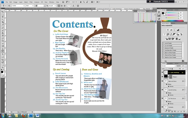
Music Magazine: Using the Grid
I wanted to make sure all my text was in line with each other, in order to do this I used the grid on photoshop which was important for me to learn to complete my magazine :


To select the grid I go on view on the top bar, then to show and click on grid to show the grid on my page.
I have used the grid to line up the texts on my magazine pages:


To select the grid I go on view on the top bar, then to show and click on grid to show the grid on my page.
I have used the grid to line up the texts on my magazine pages:


Friday, 1 March 2013
Music Magazine: Using the Magnetic Lasso Tool
This is proof that I used Photoshop to create my magazine, this is me using the magnetic lasso tool which was important for me to learn to complete my magazine:
.JPG) And this is how I did it:
And this is how I did it:

I select the tool

Then draw around the shape with the mouse that I want to cut out


.JPG)

I select the tool

Then draw around the shape with the mouse that I want to cut out


Thursday, 28 February 2013
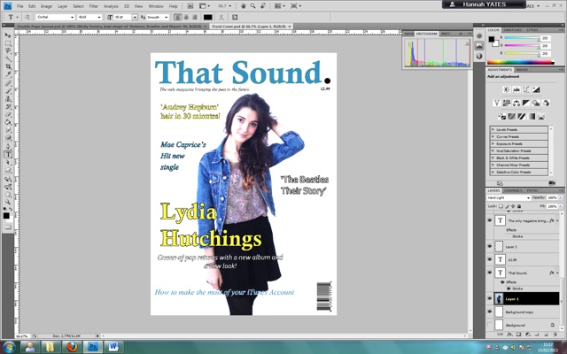
Music Magazine: Improvements
My Teacher informed me that my front cover, had a lack of writing on it and it needed something more, she also suggested to me that I moved the writing over to the left more because of the way magazines are laid out in newsagents, some important bits of my writing wouldn't be seen and this could affect my magazine. Finally she suggested that I should add a bar at the bottom of my front cover because they are very popular with magazines and it will fill my magazine more.

.JPG)
This was my front cover before:

This is my improved front cover:
.JPG)
Music Magazine: Location Choices
These are the different locations I used when taking my photographs:
I used these locations because they had very plain backgrounds and I knew from the planning of my magazine that I wanted a white background for my front cover, and also for the double page spread I knew I wanted to cut out the people from the pictures and I thought it would be easier to use the magnetic lasso tool on a plain background.


I used these locations because they had very plain backgrounds and I knew from the planning of my magazine that I wanted a white background for my front cover, and also for the double page spread I knew I wanted to cut out the people from the pictures and I thought it would be easier to use the magnetic lasso tool on a plain background.
Music Magazine: Improvements
My teacher Mrs Howlett informed me that the background of my double page spread didn't match the other two pages and to keep it in with my house style I should keep the background white.
This was before I changed my background:

However when I changed it back to white, I thought it looked too plain, so I took my picture of a record, placed it in the middle of the page and changed the opacity to 30% so it looks far away in the distance:
.JPG)
This was before I changed my background:

However when I changed it back to white, I thought it looked too plain, so I took my picture of a record, placed it in the middle of the page and changed the opacity to 30% so it looks far away in the distance:
.JPG)
Wednesday, 27 February 2013
Music Magazine: Editing
Adding the record. Through my research I have noticed that magazines had recognisable features to ake the audience remember their brand. I want the record to be a recognisable feature of the magazine, if people saw writing with a record for the letter O they would think of my magazine 'That sound.'
I have a picture of a record:
.JPG)
That I have cut round using the magnetic tool on photoshop:

Now I have pasted it over the 'O's in the headings in my magazine:


I have a picture of a record:
.JPG)
That I have cut round using the magnetic tool on photoshop:

Now I have pasted it over the 'O's in the headings in my magazine:


Music Magazine: Improvements
My teacher Mrs Howlett informed me that my double page spread could be confused for a fashion magazine instead of a music magazine, so I have decided to alter the paragraphs at the top of the pages, this makes the pages relate more to music, however not changing my idea.
My paragraphs used to read:
'Lydia Hutchings new album 'The Truth About Us', available from 20th April 2013'
'Molly Dunlea, lead singer of 'Violence, Bowties and Blazers' their first album 'Ignore This', released 13th March 1967'
They now read:
'Lydia Hutchings new album 'The Truth About Us', available from 20th April 2013. In her new music video of her single 'Fight' she is seen wearing this outfit, you to can have the look.'
'Molly Dunlea, lead singer of 'Violence, Bowties and Blazers' their first album 'Ignore This', released 13th March 1967. In their first live performance of 'Liana' she was seen wearing this outfit, you to can have a similar vintage look of the past artist.'
Tuesday, 26 February 2013
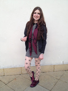
Music Magazine: Choice of Actors and Outfits
 I chose Lydia and Molly to be my actors because Lydia is my Future artist and she has wide, bright eyes, which I thought would help a lot with making the audience feel engaged, her looking into the camera shows a connection between the audience and Lydia. Also I chose Molly because she is already in a band which helps, also because she has a lot of vintage clothing and I thought she could help me with portraying a past artist.
 I chose these outfits for Lydia because they look nice on her although they don't look too fancy or expensive, which would let the readers of my magazine believe that you don't need a lot of money or expensive clothes to look nice, this will work in my favor as my target audience do not have a lot of money to spend. Also the clothes are suited to the genre.
Finally I chose the outfit for Molly because they look quite vintage and she is my past artist, so the vintage clothes will help my magazine look more realistic.
Music Magazine: Second Photo Shoot (Molly)
This is a selection of the Photos from my second photo shoot with my second model, some of them I will use and others I will not.


I would not use this photo as the models head placement is wrong, she moved as I took the photo and so it wouldn't look right in my magazine.

I would use this photo as the head placement is correct, her whole body is in the shot and also the photo is in perfect focus so it is a good photo.
I would use this photo as the whole body is in shot and the photo is in focus, also she is not looking directly into the camera, and her posture is mature and suitable for older generations.

However this photo does not have a good posture, the models posture and facial expression looks like it would appeal to a very young audience, and wouldn't suit the audience I am aiming for.

I would use this photo as I have a clear shot of the ring and so I could cut around it using the magnetic tool on paintshop easily to add to my double page spread.

I would use this photo as the whole body is in shot and the photo in in focus, also the models eyes are looking directly into the camera.

I would use this photo because there is a nice clear outline of the shoe which I can easily follow with the magnetic tool on paintshop and add the shoe to my double page spread.
Friday, 15 February 2013


Music Magazine: House Style
I have developed a blue, yellow and black and white house style which is very obvious to see in my front cover and contents.
Thursday, 14 February 2013
Music Magazine: Editing
I have decided to use three fonts on my front cover to make it look more appealing and I have also used 'hard light' effect on my photo to make the background very plain and makes the photo stand out more. This is the original photo:

This is my front cover so far:

Also I took my bar code from the Internet to make my magazine look more realistic:


This is my front cover so far:
Also I took my bar code from the Internet to make my magazine look more realistic:

Music Magazine: Editing
I have taken photos for my music magazine that I need to get rid of the background for example this one:

I have cut around the edge of the shorts with the magnetic lasso tool then copied it:

I then pasted it on my double page spread:


I have cut around the edge of the shorts with the magnetic lasso tool then copied it:

I then pasted it on my double page spread:

Subscribe to:
Comments (Atom)